I think the video is a perfect view of effects you can learn to perfect to the client liking.
The opening scene was very impressive, and towards the last part seemed great with the simple font and the color of it. And the text on the very last tag seemed to have very simple and amazing font. I don't suggest to make the text a little more colorful because it will be noisy and distracting with all the color that the multimedia have going on in the background.
Various methods are used to create and combine symbols, images and words to create a visual representation of the ideas and messages of the company.
Space was the area provided for a particular purpose such as in this multimedia you can see that it have three dimensions (length, width, and height). Space includes the background, foreground and middle ground.
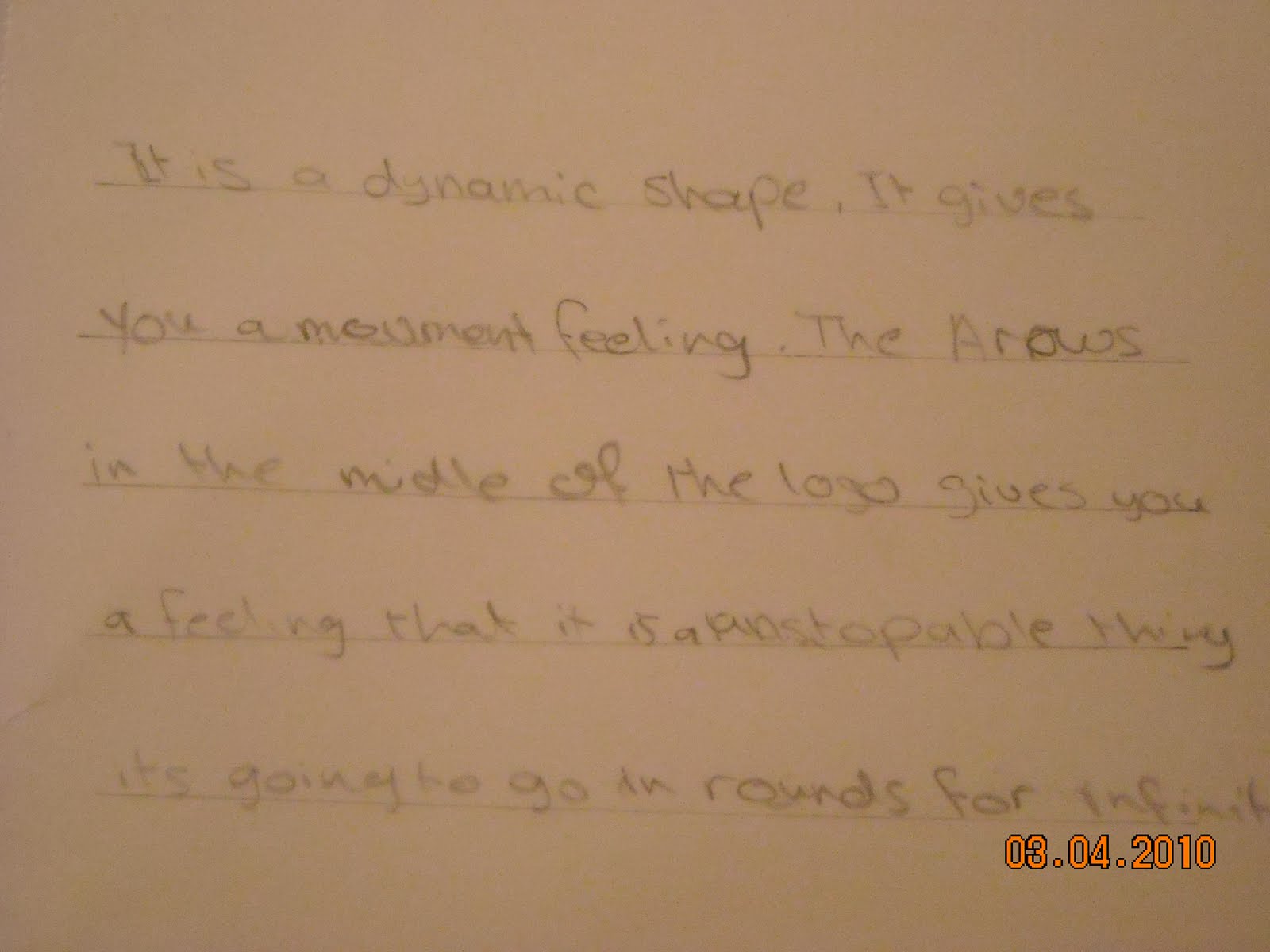
Lines was the basic element that refers to the continuous movement of a point along a surface, as you can see in this multimedia there is lot of type of lines and shapes :(circle,square, triangle, and more) and each one of them gives you a specific feeling. and every line and shape has length, thickness, and direction. There are curve, horizontal, vertical, diagonal, zigzag, wavy, parallel, dash, and dotted lines which most of them were in this multimedia presentation.
Balance it was achieved by the location of objects, volume and sizes of objects, and by color. Balancing lighter colors with darker colors, balance bold colors with light neutral colors.
Color Red colors seem to come forward while blue seems to recede into the distance. the background of this multimedia presentation was blue .contrasting color was used to draw the attention to a particular part which they wanted to draw attention to it.
Texture was perceived surface quality.
Form was created by combining two or more shapes. (like combining the circle and the square) It was enhanced by tone, texture and color.
Unity everything in this multimedia presentation belongs there, and it makes a whole piece. It is achieved by the use of balance, repetition and design harmony. it all fits together.
Value the relationship between light and dark. It gave the objects depth and perception.